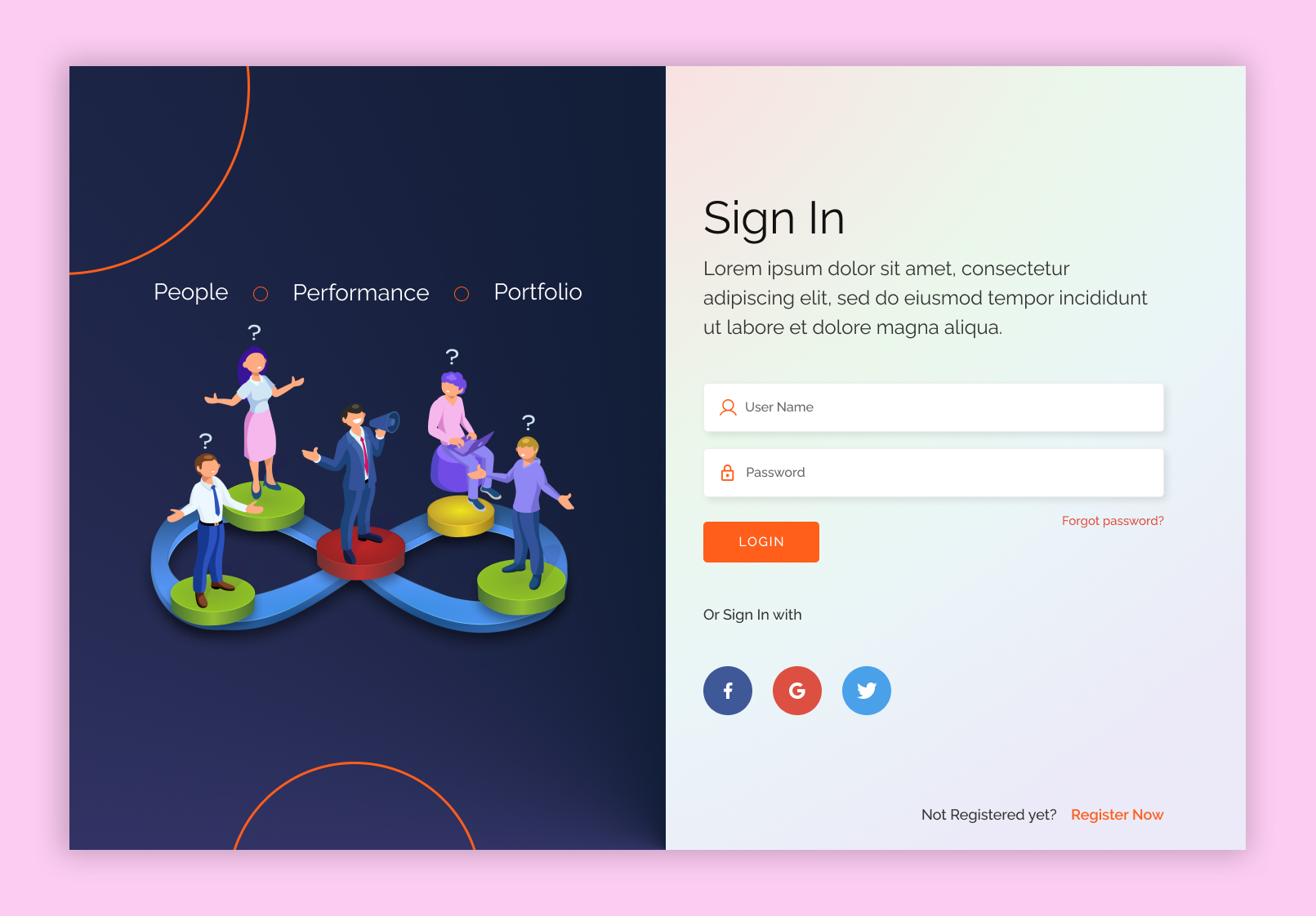
Sign Up – 1
The UI design for the “Sign Up” page focuses on simplicity and ease of use, ensuring a smooth onboarding experience for users. A clean, minimal layout with clear, concise fields and labels helps reduce user friction. The design uses intuitive icons, a progress indicator (if multi-step), and clear call-to-action buttons to guide users through each step. Friendly error messages and input validation ensure that users can easily correct any mistakes. A subtle color scheme and visual cues, like checkmarks or a success message upon completion, provide positive reinforcement, creating a seamless and welcoming sign-up experience.
Available for Freelance Projects
- Freelancer.com
- Fiverr

